Role | UX Design Consultant |
|---|---|
Timeline | 13 weeks (Jun - Sep 2025) |
Team | 1 PM, 1 founder |
Responsibilities | UX research, Lo-fi wireframes, IA redesign + heuristics |
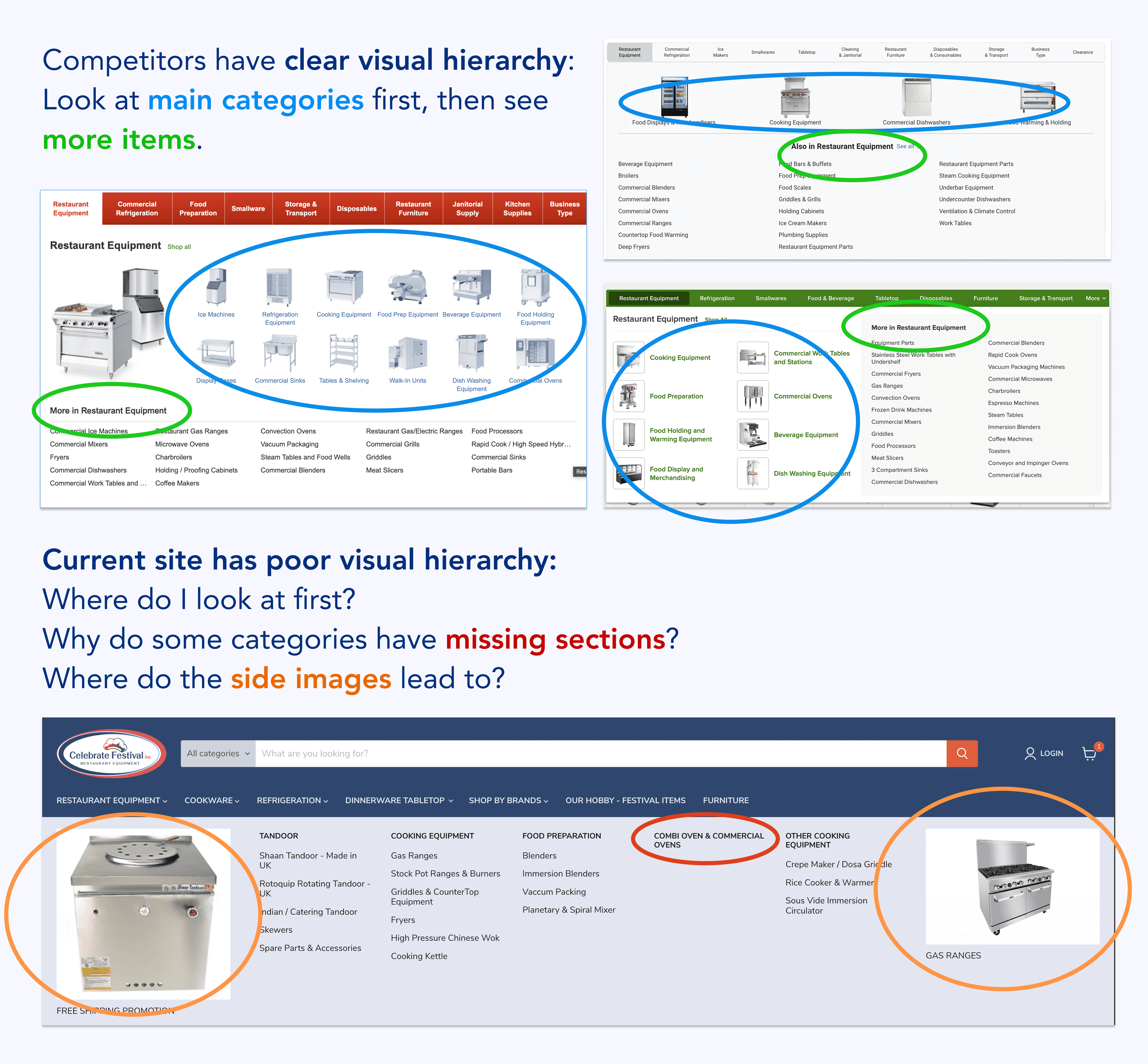
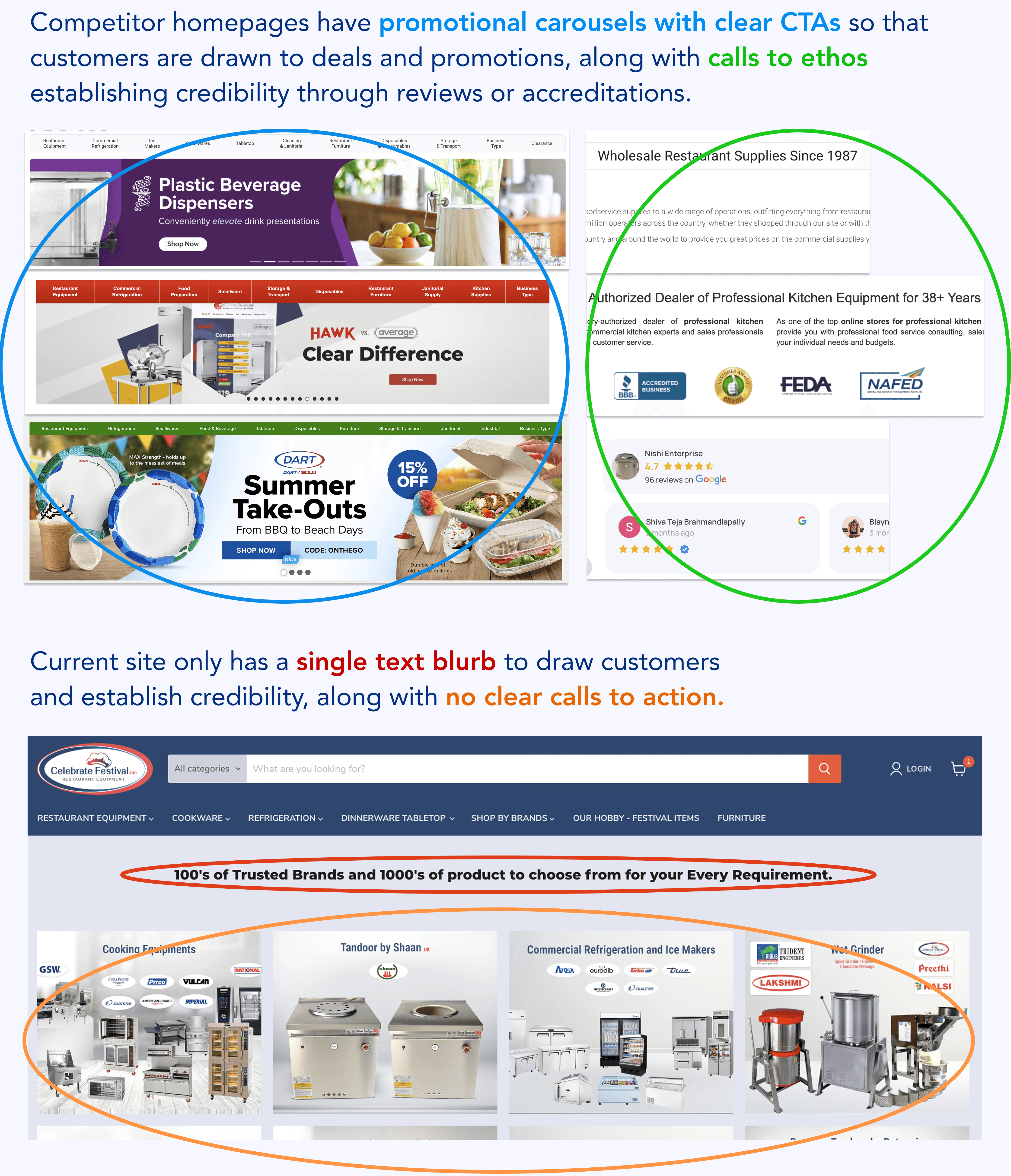
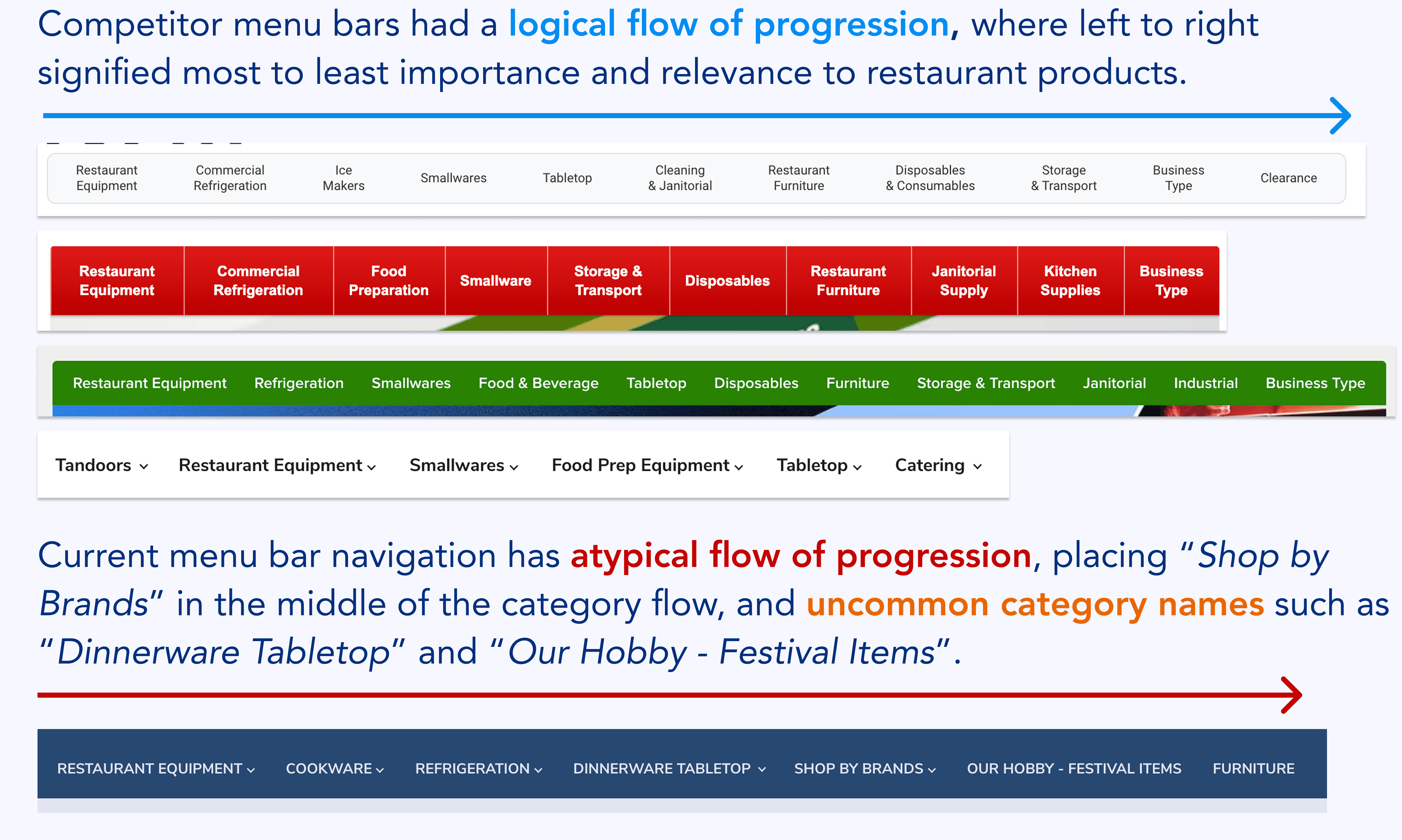
Celebrate Festival Inc is a specialty restaurant equipment and supply company in Fremont, California, with a customer base primarily consisting of Indian restaurant owners. I worked with them to address low conversion rates and poor usability on their Shopify site, and to position the business for expansion into broader markets.
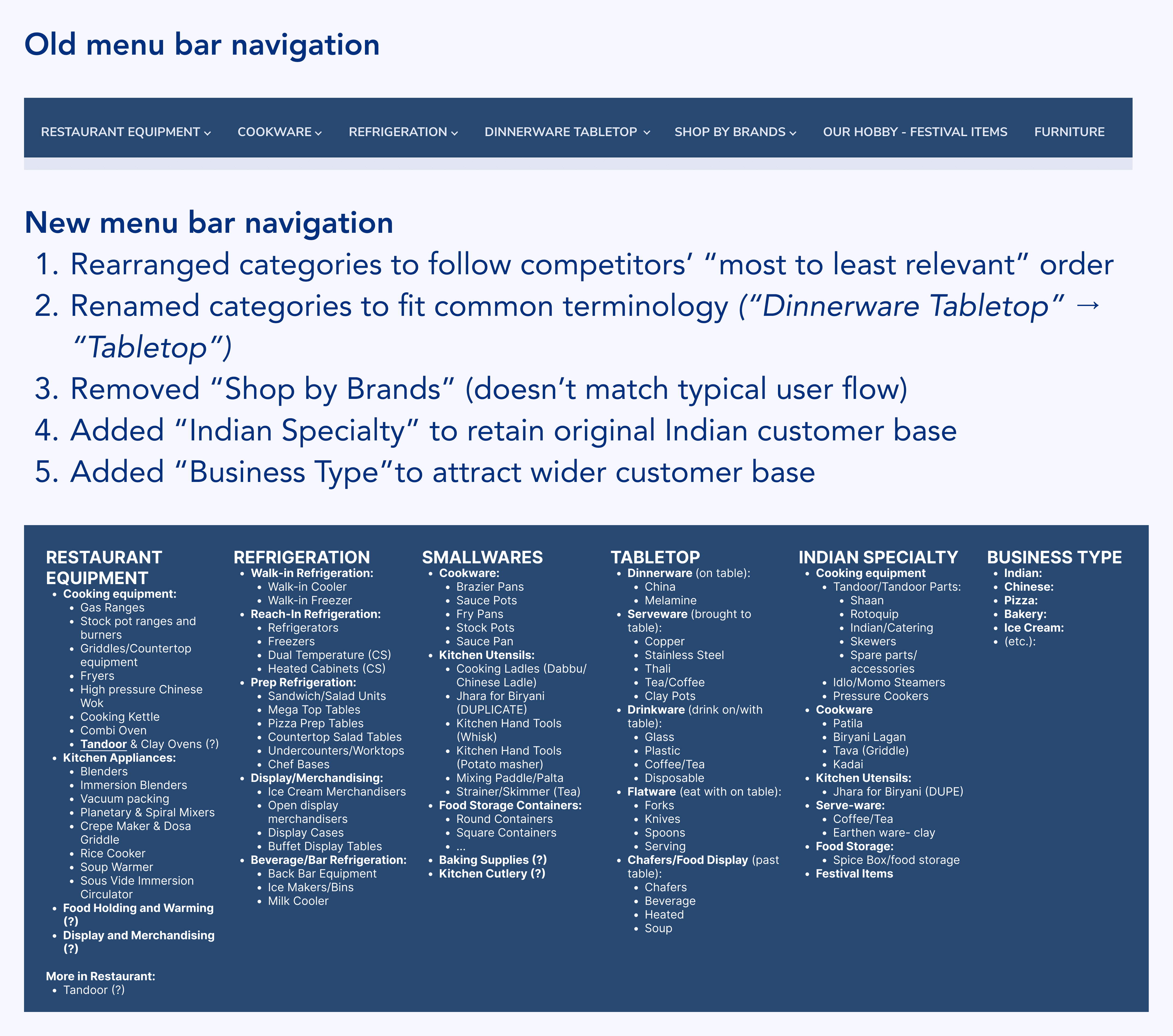
Collaborating directly with the founder and aligning with the marketing team's existing plans for a phased implementation, I created lo-fi wireframes for a site redesign, informed by a UX audit, competitive analysis of 4 leading competitors, and research into e-commerce best practices. These were later handed off to marketing and development teams for hi-fi execution and implementation.