Dayout
How can we let users discover local content while maintaining a familiar browsing experience?
Role
Product Designer
Timeline
2 months
Team
Solo Designer
Platform
Mobile App
●
Summary
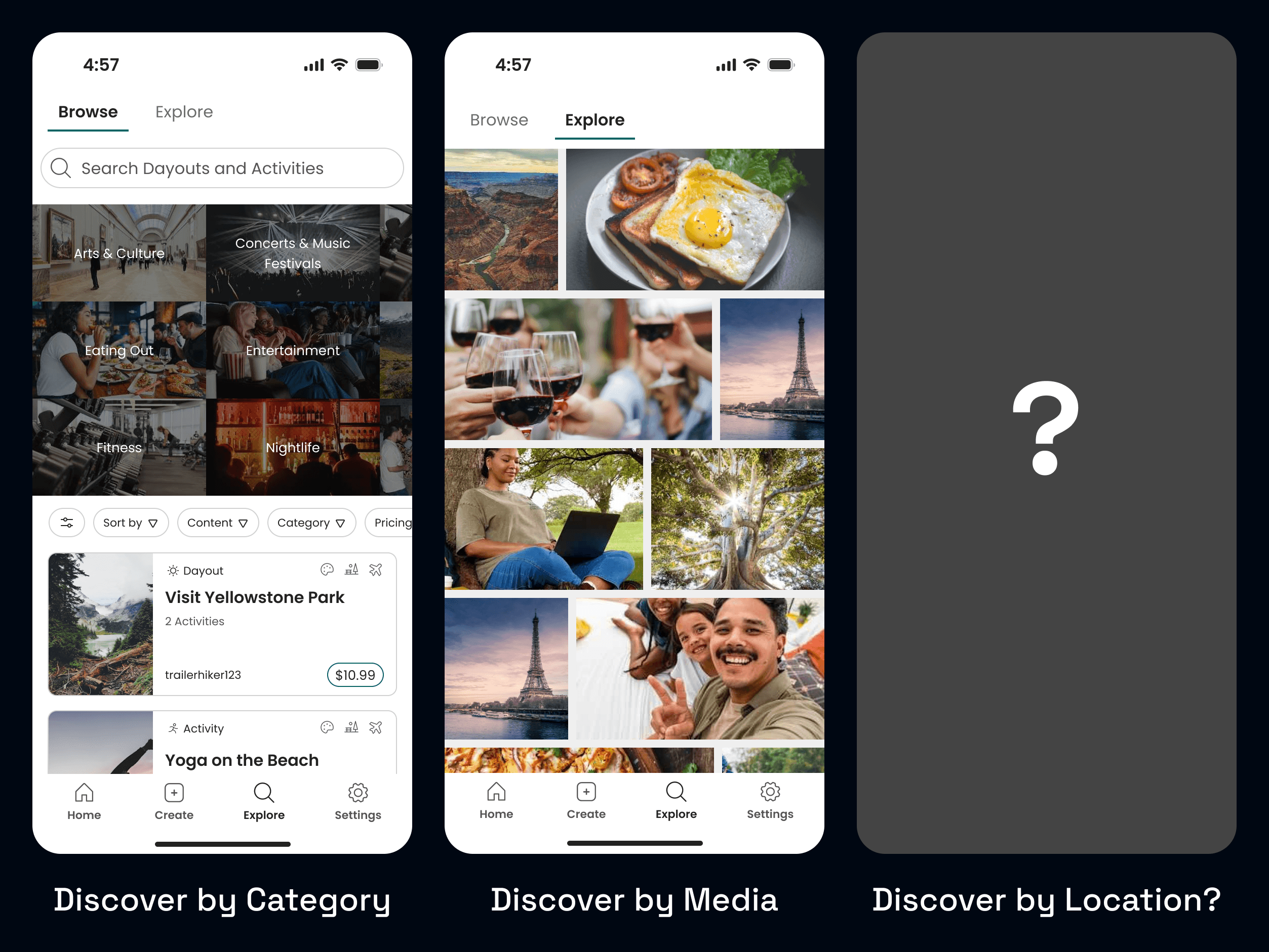
Dayout was a social planning app with no way to discover nearby content.
Users could already share their Activities and Dayouts (day-sized layouts of Activities) on the main Explore page, but had no way of seeing what was nearby.
As Product Designer, I led the design of a brand-new feature set that allowed users to tag locations, explore nearby content, and search and filter all on an interactive map.
●
Summary
Dayout was a social planning app with no way to discover nearby content.
Users could already share their Activities and Dayouts (day-sized layouts of Activities) on the main Explore page, but had no way of seeing what was nearby.
As Product Designer, I led the design of a brand-new feature set that allowed users to tag locations, explore nearby content, and search and filter all on an interactive map.
●
Context
The demand was there. We just had to act.
●
Context
The demand was there. We just had to act.
●
Context
The demand was there. We just had to act.
“I would want [a feature where] it let me like pick a location and it shows me things in the area.”
Usability Tester #1
"It would be nice to have the location, just to see an address or where it's at".
"It would be nice to have the location, just to see an address or where it's at".
Usability Tester #2
Usability Tester #2
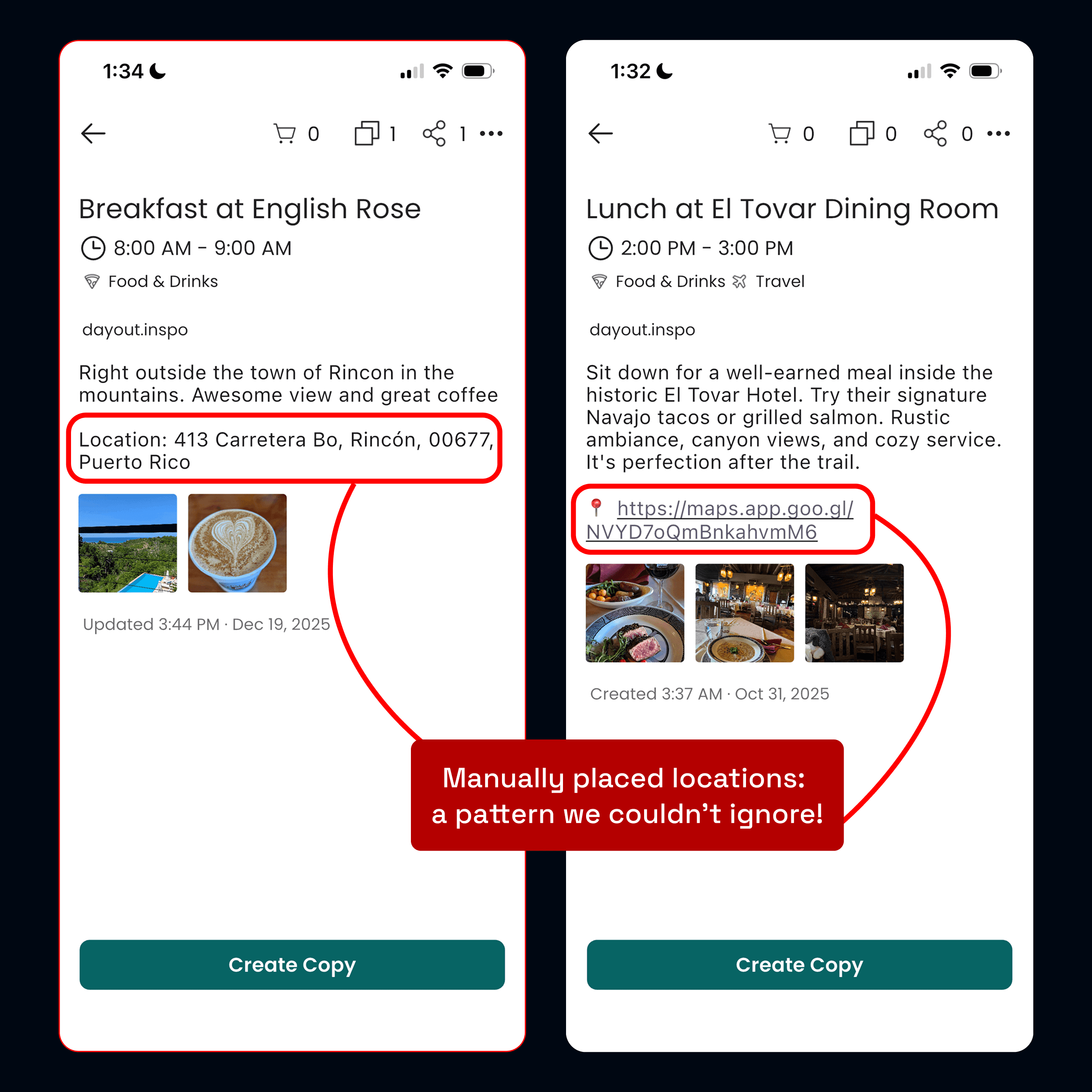
Community workarounds?
Some of our users had even started manually typing locations into the description box, signaling an unmet demand.
Community workarounds?
Some of our users had even started manually typing locations into the description box, signaling an unmet demand.
Community workarounds?
Some of our users had even started manually typing locations into the description box, signaling an unmet demand.
●
Problem
Lots of design challenges.
The time limit
We only had two months before a major marketing push, so the feature had to feel integrated but remain tightly scoped.
Representing multiple content types
Unlike other map-based discovery apps we explored, we had to support both single-location Activities as well as multi-location Dayouts, which meant handling different levels of spatial representation without making the UI feel too inconsistent.
Technical constraints
We planned to use the Google Maps API to implement. The team had no prior experience, so I had to design while simultaneously learning about the API's technical constraints and design requirements.
The main challenge:
How might we help users discover local experiences while maintaining
the intuitive browsing patterns they're already familiar with?
●
Foundation
Keeping a tight scope.
Given the time limit, I defined a singular goal: create a location-based discovery funnel that directs users from the map discovery into the app's detail page, where users see full information about a Dayout or Activity.
●
Foundation
Keeping a tight scope.
Given the time limit, I defined a singular goal: create a location-based discovery funnel that directs users from the map discovery into the app's detail page, where users see full information about a Dayout or Activity.
●
Foundation
Keeping a tight scope.
Given the time limit, I defined a singular goal: create a location-based discovery funnel that directs users from the map discovery into the app's detail page, where users see full information about a Dayout or Activity.
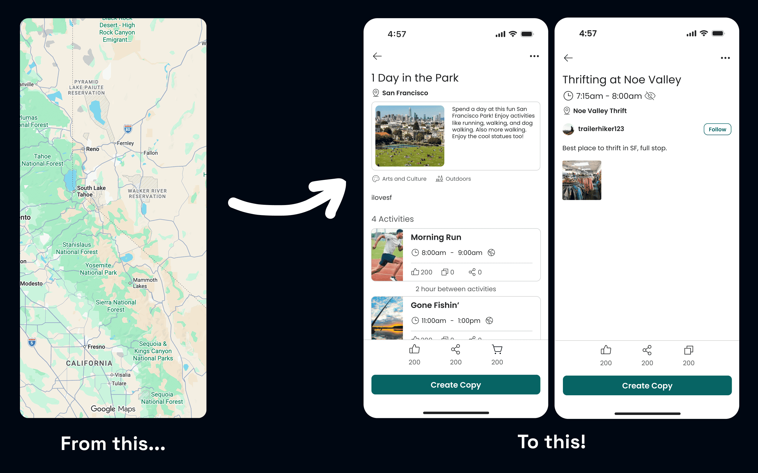
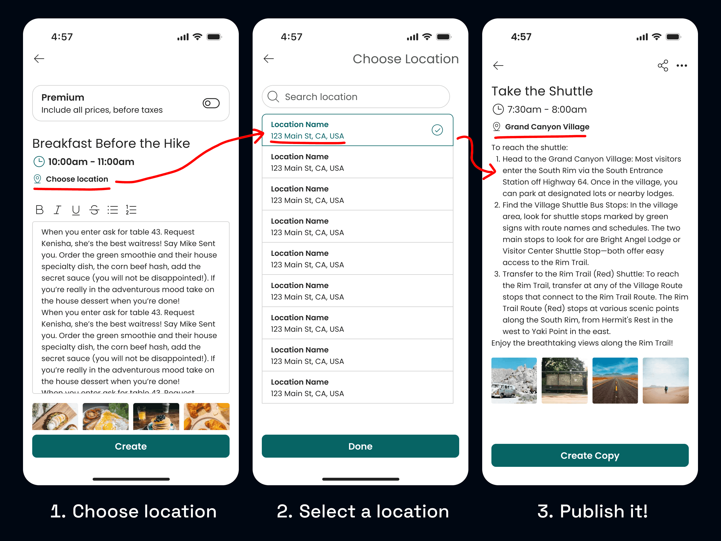
Enabling location for the content.
Before building the map, I started by adding a location tagging field to Dayouts and Activities using the Google Places API to ensure structured, mappable data.
Enabling location for the content.
Before building the map, I started by adding a location tagging field to Dayouts and Activities using the Google Places API to ensure structured, mappable data.
Enabling location for the content.
Before building the map, I started by adding a location tagging field to Dayouts and Activities using the Google Places API to ensure structured, mappable data.
●
Visuals
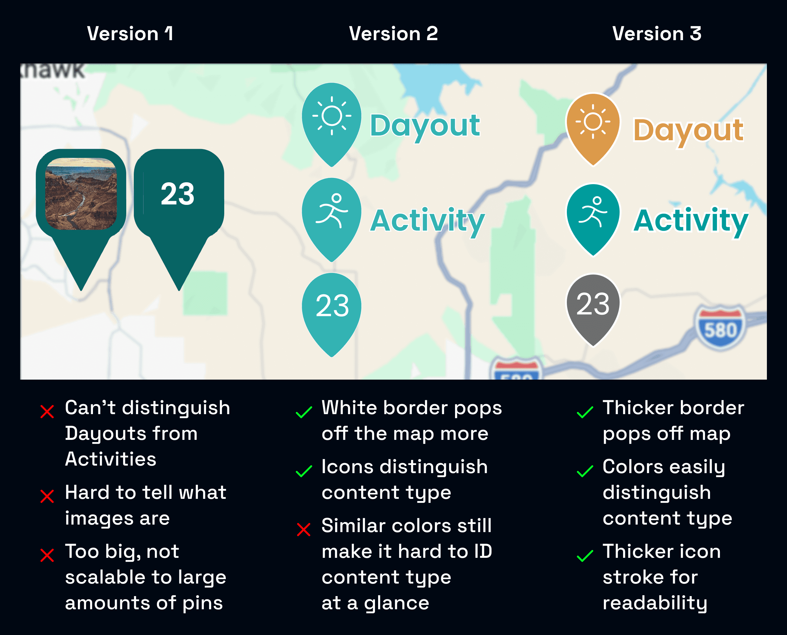
How should pins look?
I designed a pin system that distinguished Dayouts, Activities, and clusters of content, while still remaining legible at high density.
I judged each iteration based on scalability, readability, and distinguishability, with the final design using color coding and thick white borders to satisfy the criteria.
●
Visuals
How should pins look?
I designed a pin system that distinguished Dayouts, Activities, and clusters of content, while still remaining legible at high density.
I judged each iteration based on scalability, readability, and distinguishability, with the final design using color coding and thick white borders to satisfy the criteria.
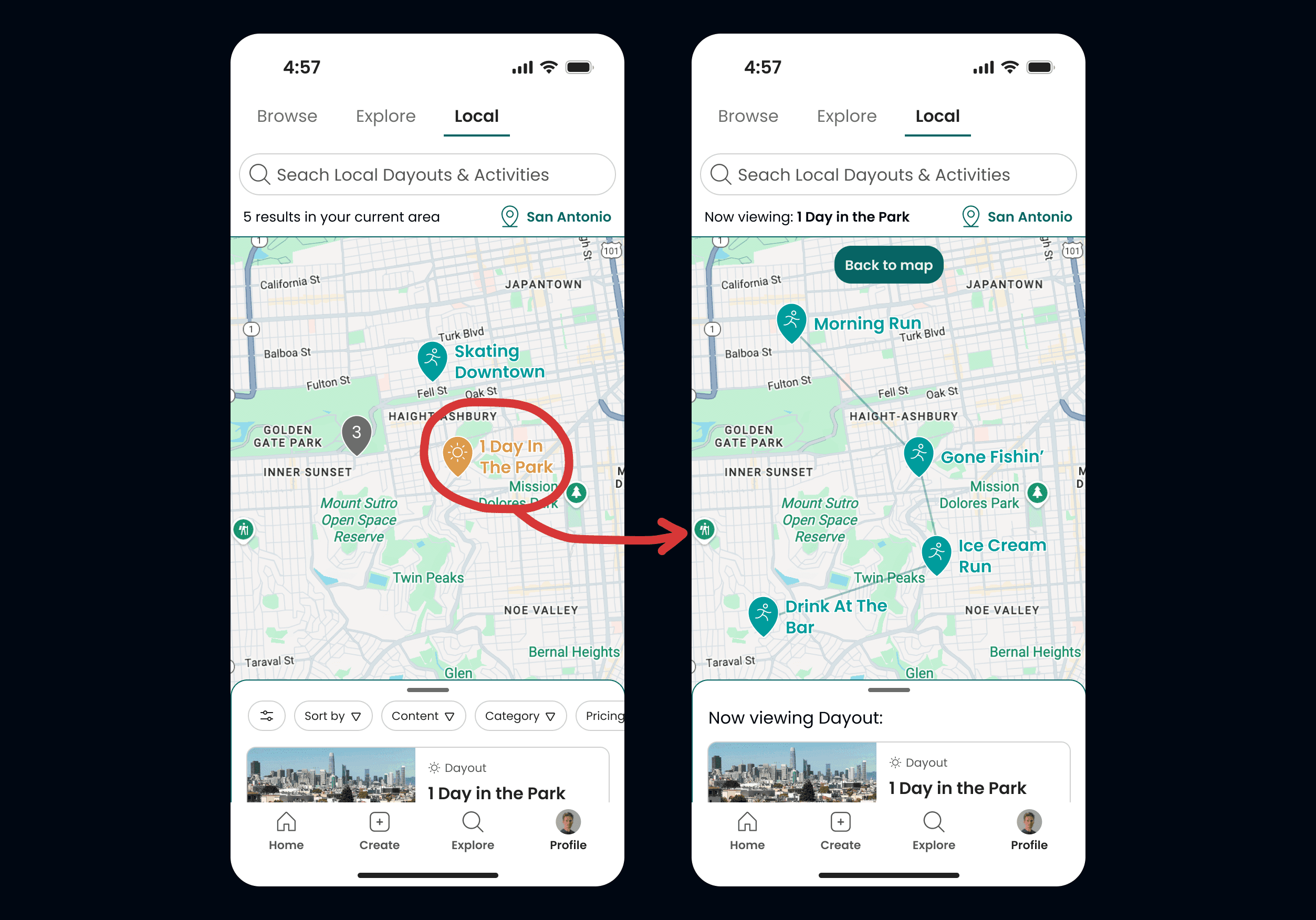
How should a Dayout look like on the map?
A Dayout is a schedule that contains multiple Activities, and thus potentially multiple different locations. A single Dayout pin can't communicate the journey of a multi-Activity experience.
To solve this, I introduced a timeline view that connects each Activity's location on the map, letting users visualize the Dayout's full path.
●
Interaction
Preview states help users keep location context.
Initally, tapping cards in the list panel sent users straight to the detail pages, missing out on where content was on the map.
To solve this, I introduced preview states that appear between list selection and detail pages. This gives users location context before choosing to view full details, maintaining spatial awareness throughout their exploration.
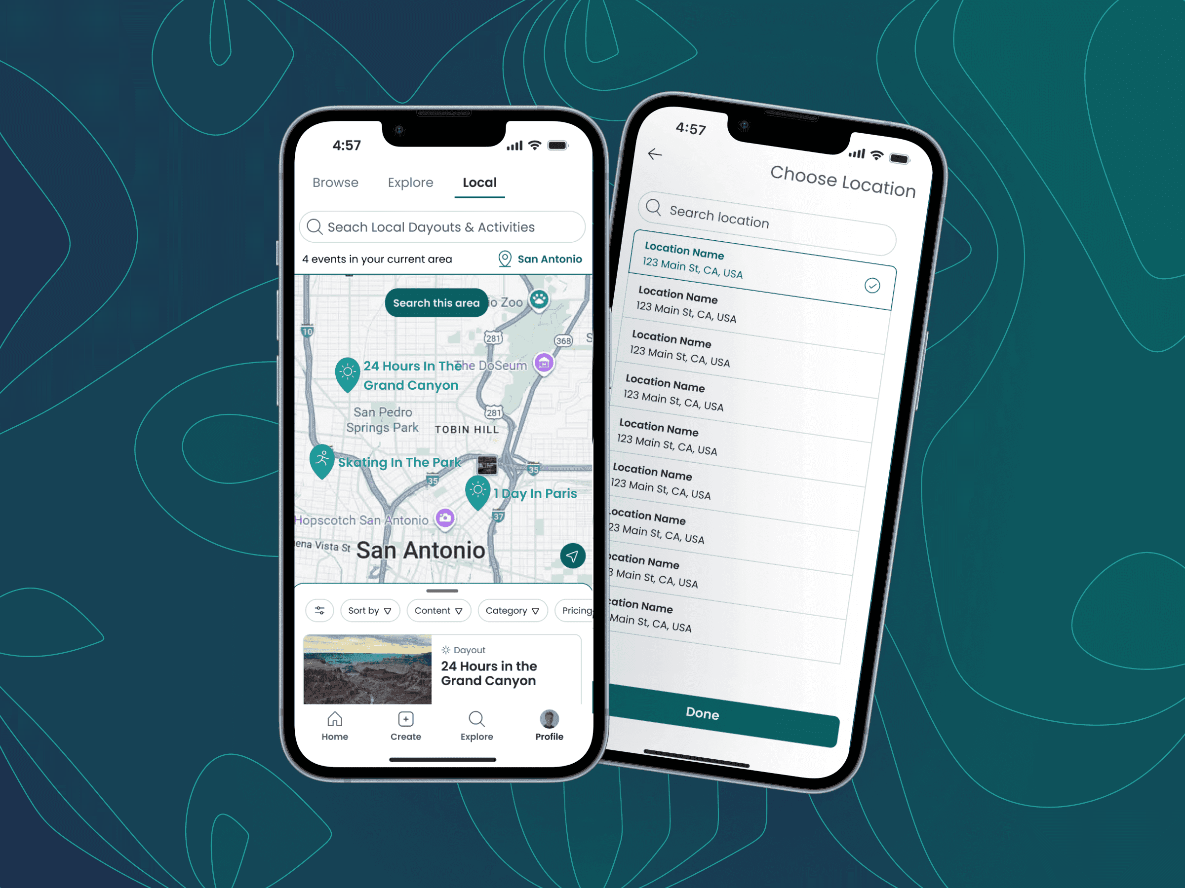
For Dayouts, the map displays the timeline view while the list panel shows the Dayout and its associated Activities.
For Activities, the map pans over to the Activity's location while its detail card appears in the list panel.
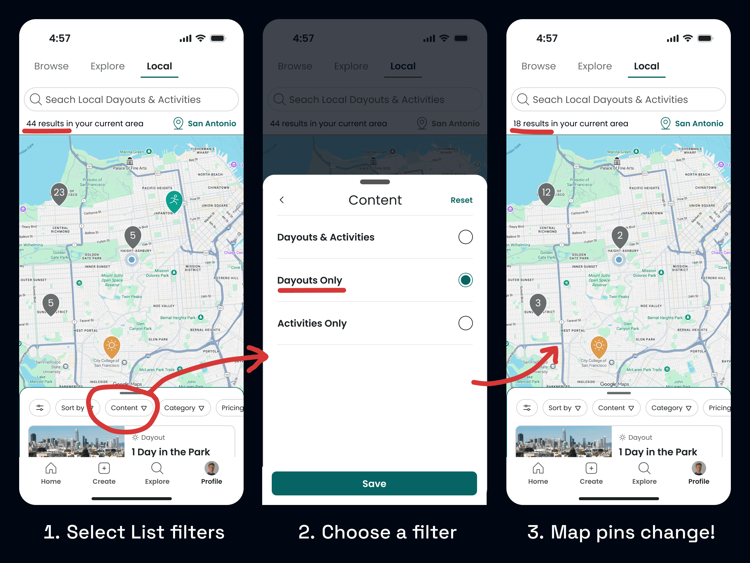
How do we sync the map and list panels?
Early iterations had the list simply reflect what was visible in the map viewport. This broke once we added sorting and filtering, since users would filter the list but see different results on the map.
To solve this, I implemented bidirectional syncing where the map's pins controls list items, and the list's filters control visible map pins. Selecting a plan in either view enters the same preview state.
This eliminated confusion and let users seamlessly switch between perspectives without losing context.
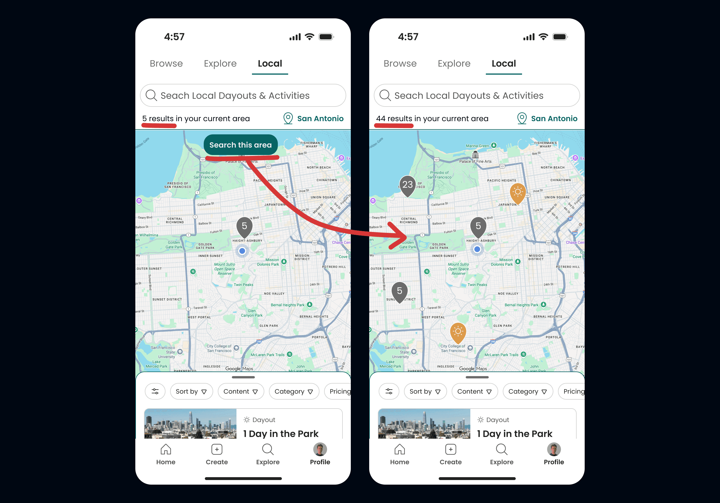
Understanding technical constraints.
My initial idea to have the map update continuously as the user pans around would have caused excessive database calls, and been overwhelming to users in denser areas.
I instead pivoted to a manual "Search This Area" button, giving the users more control over when to load new pins in an area while also reducing server costs.
●
Edge Cases
"What If..?"
"What if there are no search results?"
I added an initial prompt for "search nearby" which doubles the viewport and search radius. If that still fails, the prompt changes to "Try New Search".
"What if there are too many pins?"
The cluster pin was redesigned to have a maximum value of "99+", preventing any triple digit numbers.
"What if we want to look somewhere NOT local?"
I added a manual "location select" menu where you can choose a custom ZIP or city to select.
●
Solution
Bringing it all together.
The final experience allows users to:
Discover nearby Dayouts and Activities on an interactive map
Search for nearby content and filter results without losing spatial context
Preview itineraries geographically before viewing full details
This bridges the gap between browsing and real-world planning, letting users visualize the physical flow of a day at a glance.
Explore the area by panning, zooming, searching new areas, and tapping on cluster pins to see content previews.
Explore the area by panning, zooming, searching new areas, and tapping on cluster pins to see content previews.
Explore the area by panning, zooming, searching new areas, and tapping on cluster pins to see content previews.
Visualize Dayouts on the Map, tapping cards to show more details.
Visualize Dayouts on the Map, tapping cards to show more details.
Visualize Dayouts on the Map, tapping cards to show more details.
Visualize Activities on the Map, tapping cards to show more details.
Visualize Activities on the Map, tapping cards to show more details.
Visualize Activities on the Map, tapping cards to show more details.
Filters and searches update the map and list in real time, maintaining spatial context.
Filters and searches update the map and list in real time, maintaining spatial context.
Filters and searches update the map and list in real time, maintaining spatial context.
●
Reflection
What did I learn?
Early User Validation
Usability testing was crucial for us to understand that our problem was worth solving. A competitive analysis was also huge for understanding common UX patterns and not reinventing the wheel.
Understanding Technical Constraints
Jumping into the Google Maps API and understanding its constraints was an interesting challenge, but crucial for such a tech-heavy feature and for handoff to development.
Systems Thinking
With so many moving pieces, like the search panel, map panel, and list panel, thinking through how they all interweave was a big undertaking, and I’m proud of how it turned out.
Next steps?
I’d test how the feature performs in denser areas with lots of content, making sure pins don’t get overwhelming, and run usability tests across all location screens with clear tasks for users.
Once launched, I’d also like to track real-world usage to see how this feature compares to the main Browse and Local discovery flows.